Fifty Shades of Concrete: How Bathurst and Bloor Lost Its Character
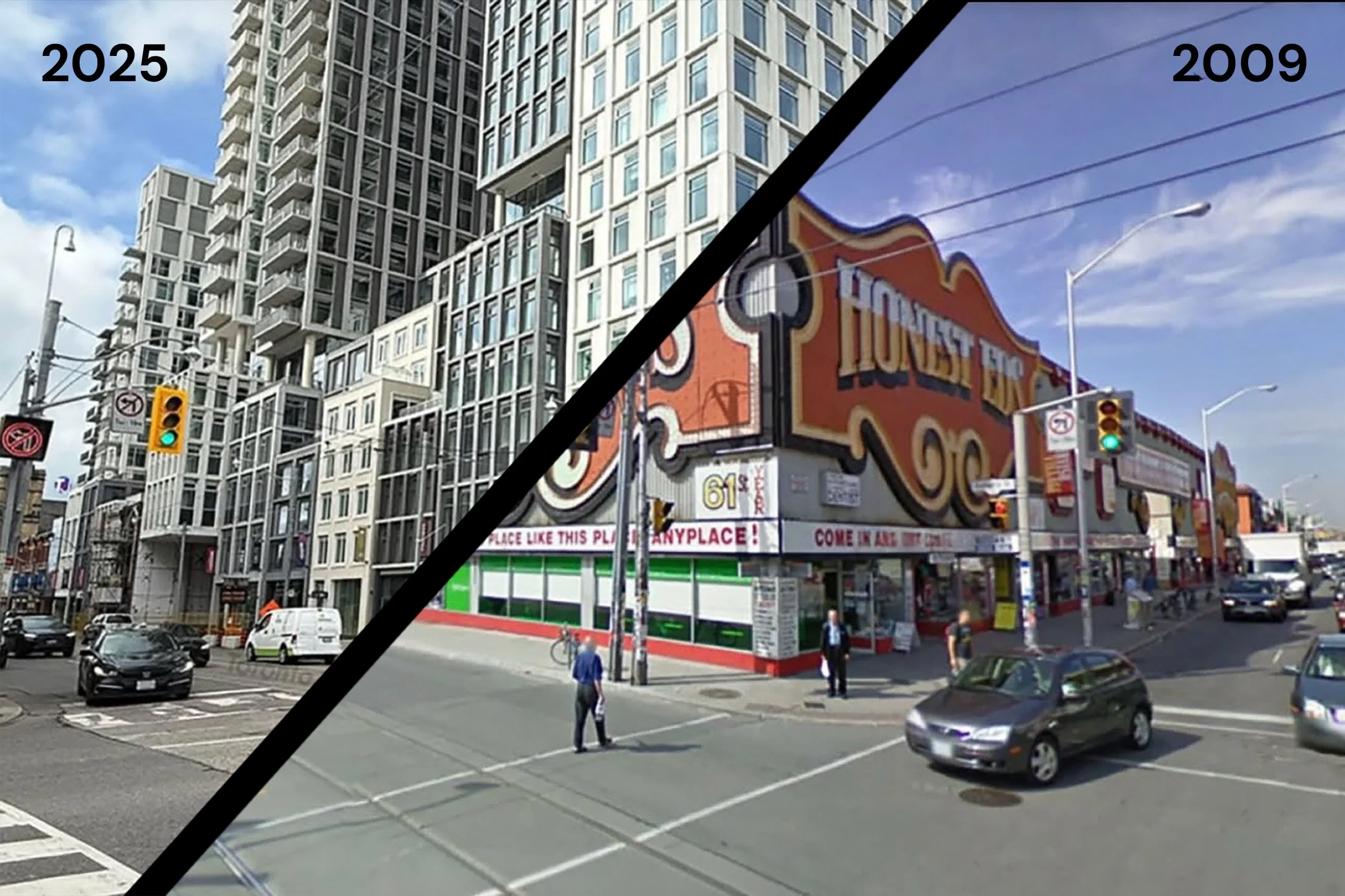
The corner of Bathurst and Bloor streets in Toronto 2009 vs. 2025.
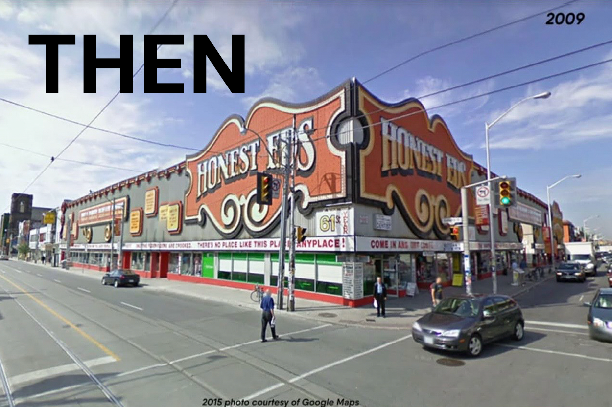
For decades, the corner of Bathurst and Bloor did not just sit on the map; it shouted. Honest Ed’s neon signs, hand-painted lettering, and chaotic window displays turned an ordinary intersection into one of Toronto’s most recognizable landmarks. It was messy, loud, affordable, and deeply loved. You did not need directions; you just told people, “Meet me at Honest Ed’s.”
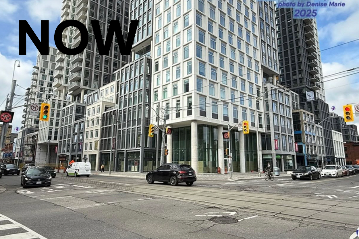
Today, that same corner feels muted and interchangeable. The site has been transformed into a contemporary condo development: tall, dense, and marketable. On paper, it checks all the urban-planning boxes: more housing, more retail, more people living close to transit. And that is important. Cities need to grow and intensify, and no one reasonably expects a mid-century bargain emporium to last forever.
But here is the problem: in replacing Honest Ed’s, we erased it. The new buildings make almost no visual or emotional reference to the landmark they replaced. There is no nod to the iconic marquee, no playful signage, no hint of the theatrical chaos that made this corner special. If you did not know what used to stand here, you would never guess this was once one of Toronto’s most distinctive streetscapes.
This is not about being anti-development or anti-condo. It is about how we grow. Great cities layer history and memory into new projects. They borrow colours, forms, materials, or stories from what came before and re-interpret them for a new generation. That is how you get density without homogeneity, and how you avoid every intersection feeling like it could be anywhere.
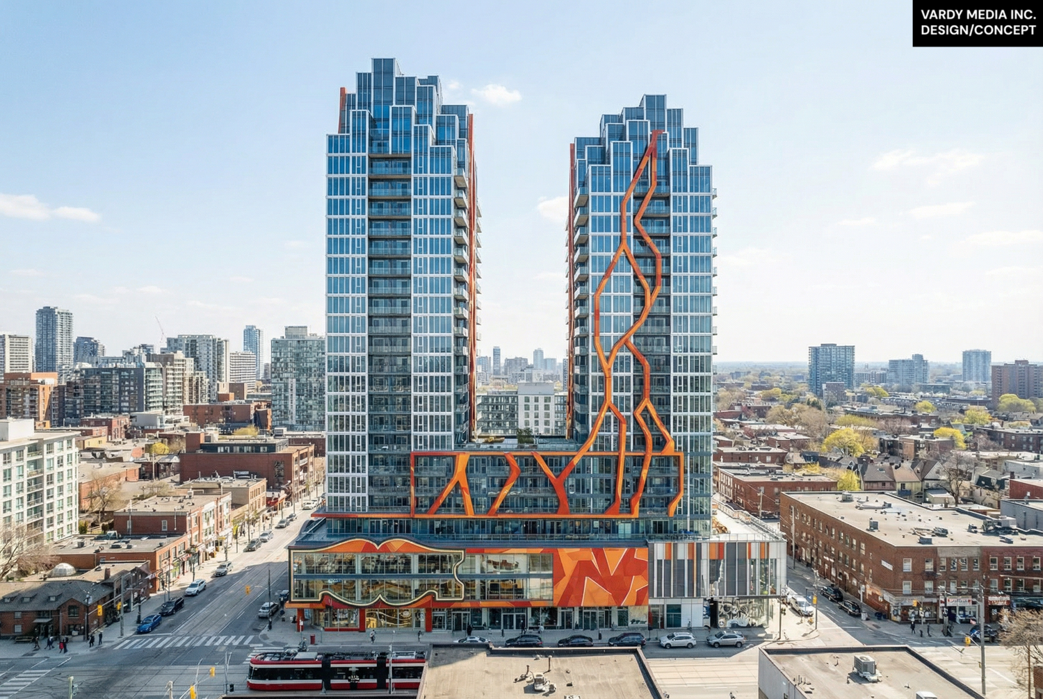
In our studio, we asked a simple question: what if this corner had evolved instead of reset? What if the new development had carried forward even a fraction of Honest Ed’s personality through lighting, signage, public art, or a bolder façade language?
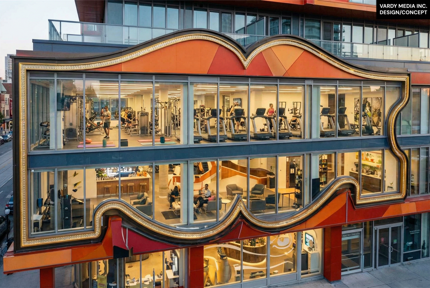
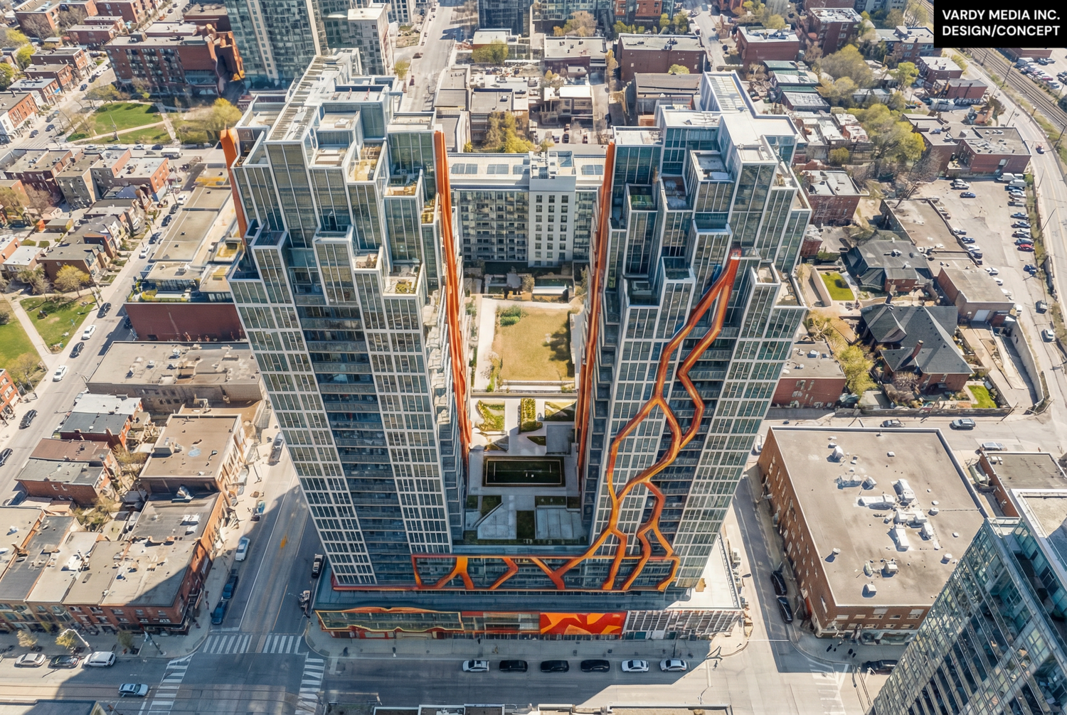
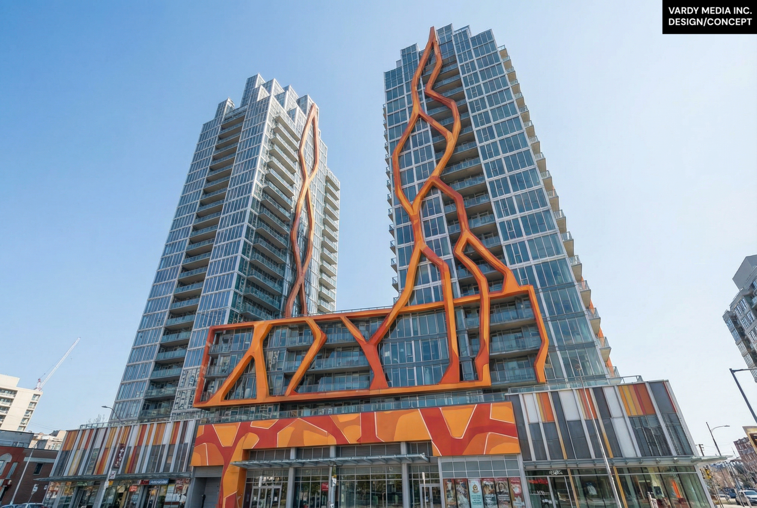
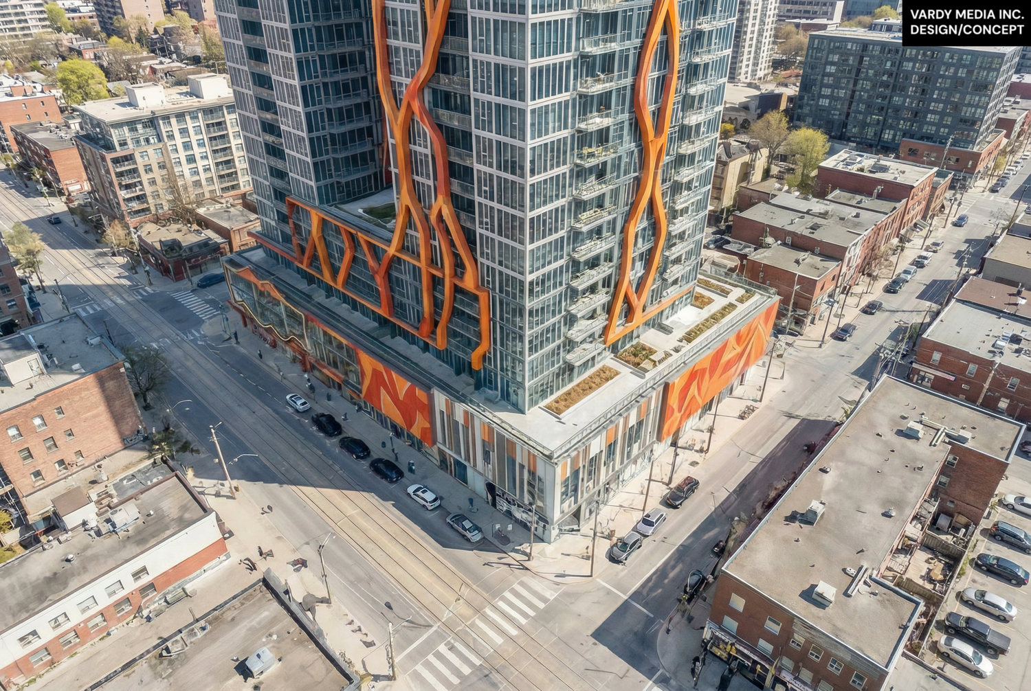
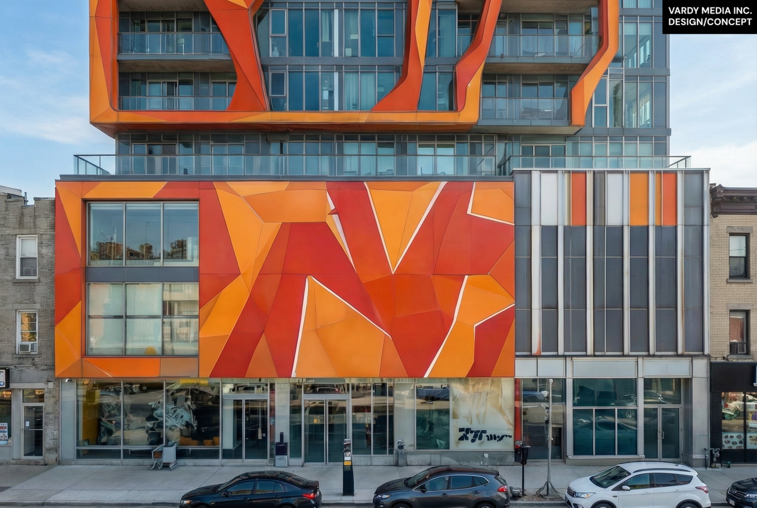
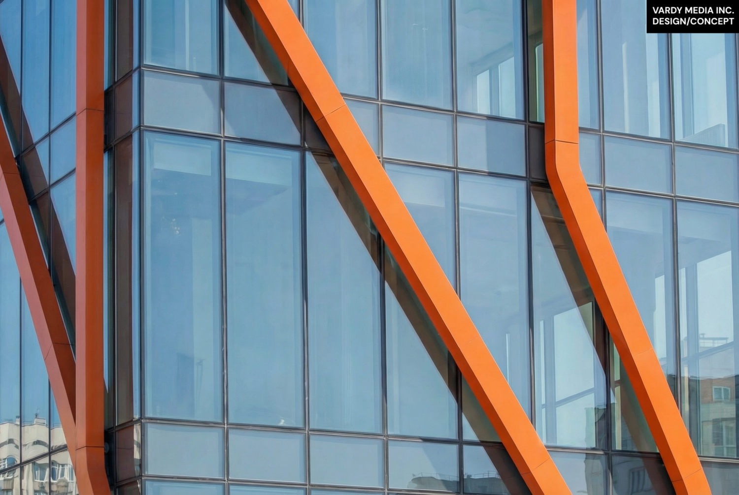
In the concepts attached to this post, you will see one possible answer. Using a mix of on-site photography, 3D tools, and AI-assisted rendering, we kept the iconic marquee sign shape and turned it literally into the window for the amenity spaces, so the gym, party room, and shared areas are framed inside that familiar outline and glow out onto the street. The Honest Ed’s orange stretches up and across the façade, pulling that energy vertically rather than erasing it. At the top, instead of a typical flat rectangle, the tower breaks into a series of pillars inspired by the basalt columns found in nature around the world, giving the skyline a sculpted, memorable profile.
What happened at Honest Ed’s matters because it sets a precedent. If we treat every beloved corner as a blank slate, Toronto slowly becomes a city of interchangeable boxes. If we instead demand that new developments reflect the spirit of what they replace, we get something better: growth that feels like continuity instead of amnesia.
Scroll through the images and watch the video clip to see the concept we created for what this corner could have been, and to imagine how future projects across the city might do a better job of honouring the places we have already lost. 💡